Find on-campus research participation opportunities with ease
Client
Study Spotter
Year
2024
Description
Scope of Work

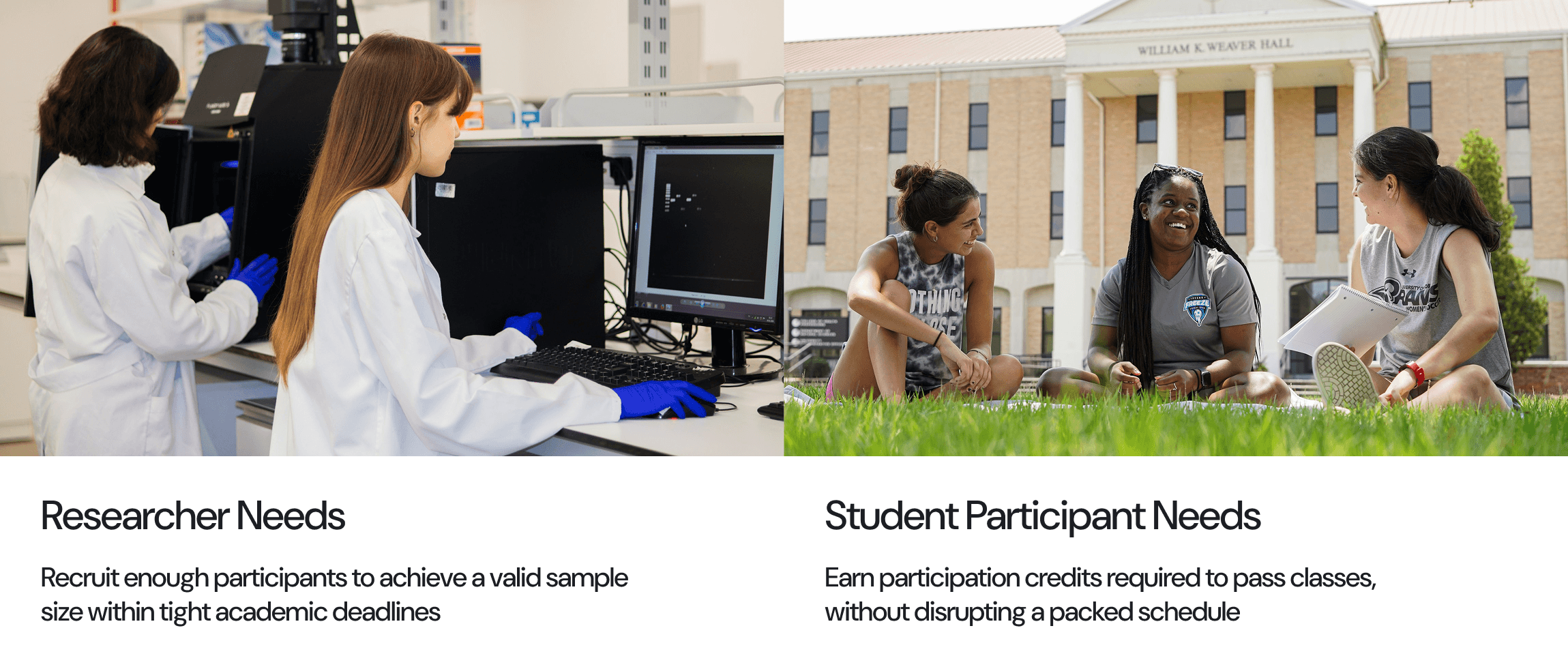
The Problem
University research depends on a steady pipeline of student participants, yet the systems connecting researchers with participants are scattered, inefficient, and often invisible to the people who need them most. Student researchers struggle to recruit beyond their immediate social circles, while potential participants have no reliable way to find studies that fit their schedule, major, or interests.
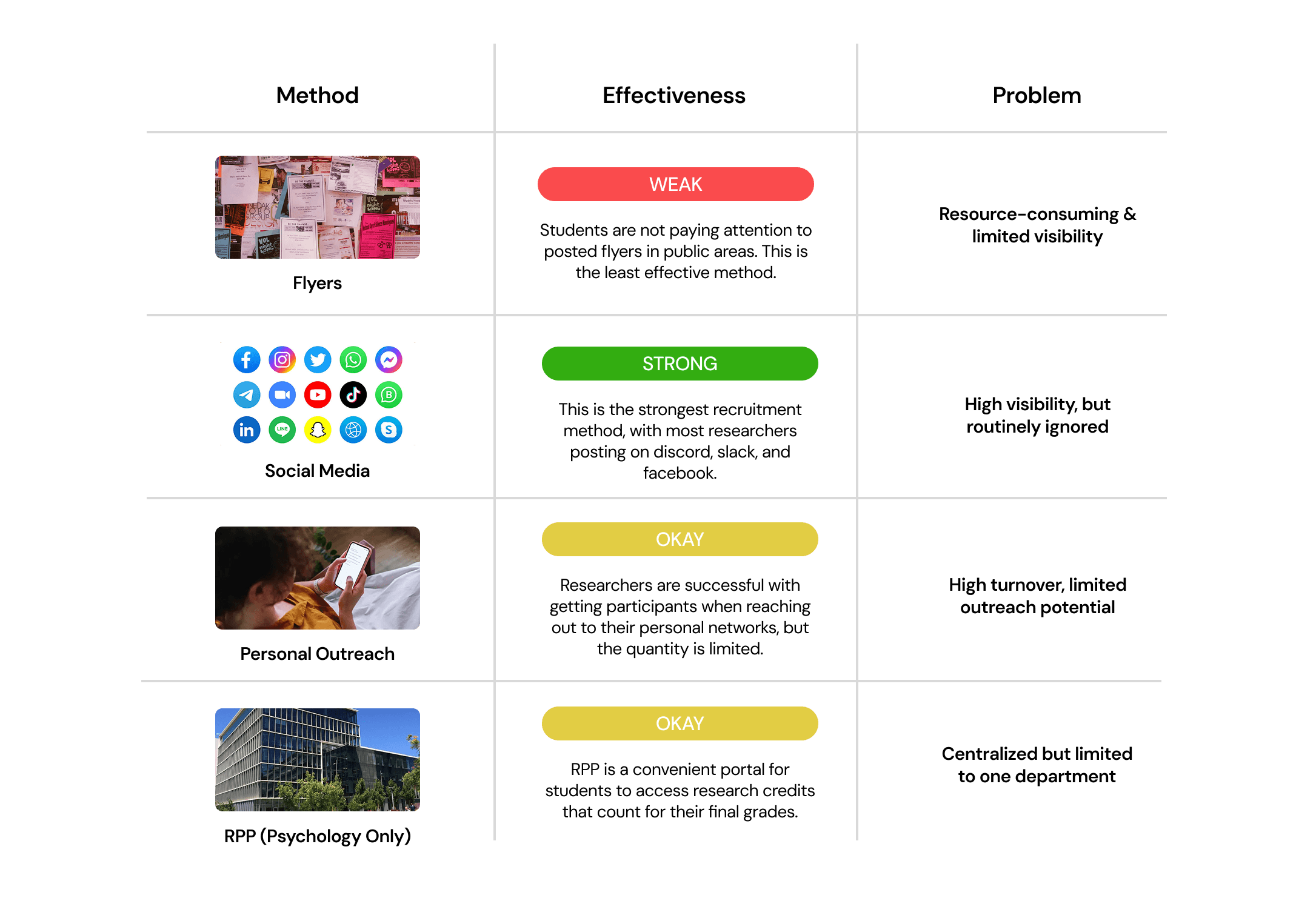
The two sides of this problem compound each other: researchers resort to flyers, social media spam, and personal networks, all of which have low conversion and high effort. Participants, meanwhile, scroll past recruitment posts because they've been trained to ignore them.
TWO SIDES OF THE SAME PROBLEM
Research
I used three methods to understand the problem space: in-depth interviews with both researchers and participants, an observational study of how researchers currently recruit, and a competitive analysis of existing solutions.
What People Are Actually Saying (User Segment Interviews)
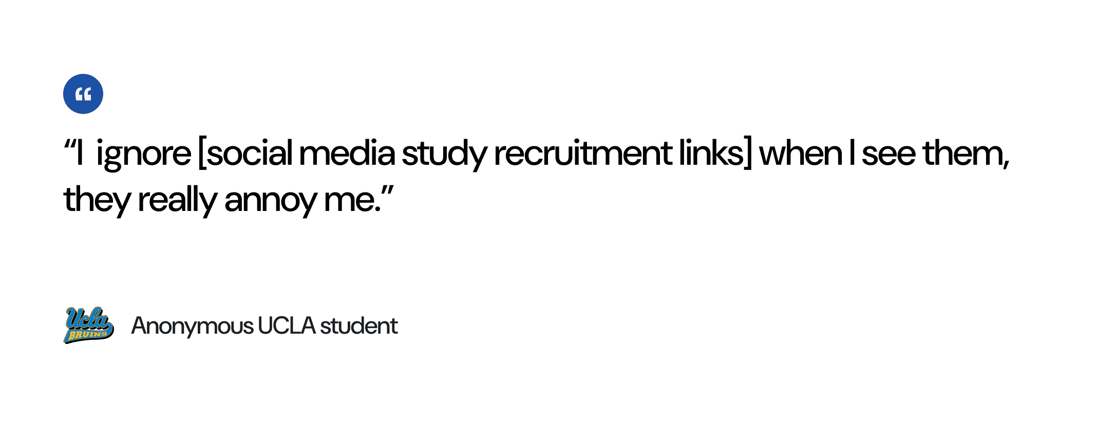
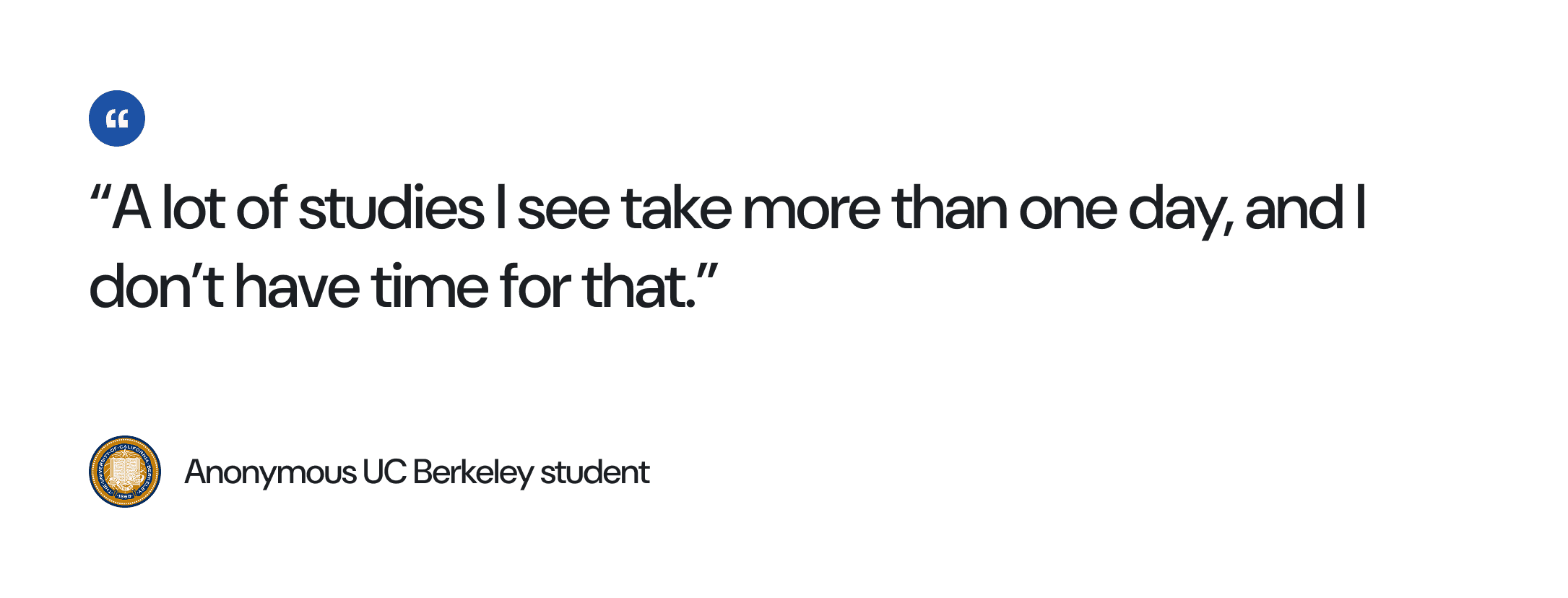
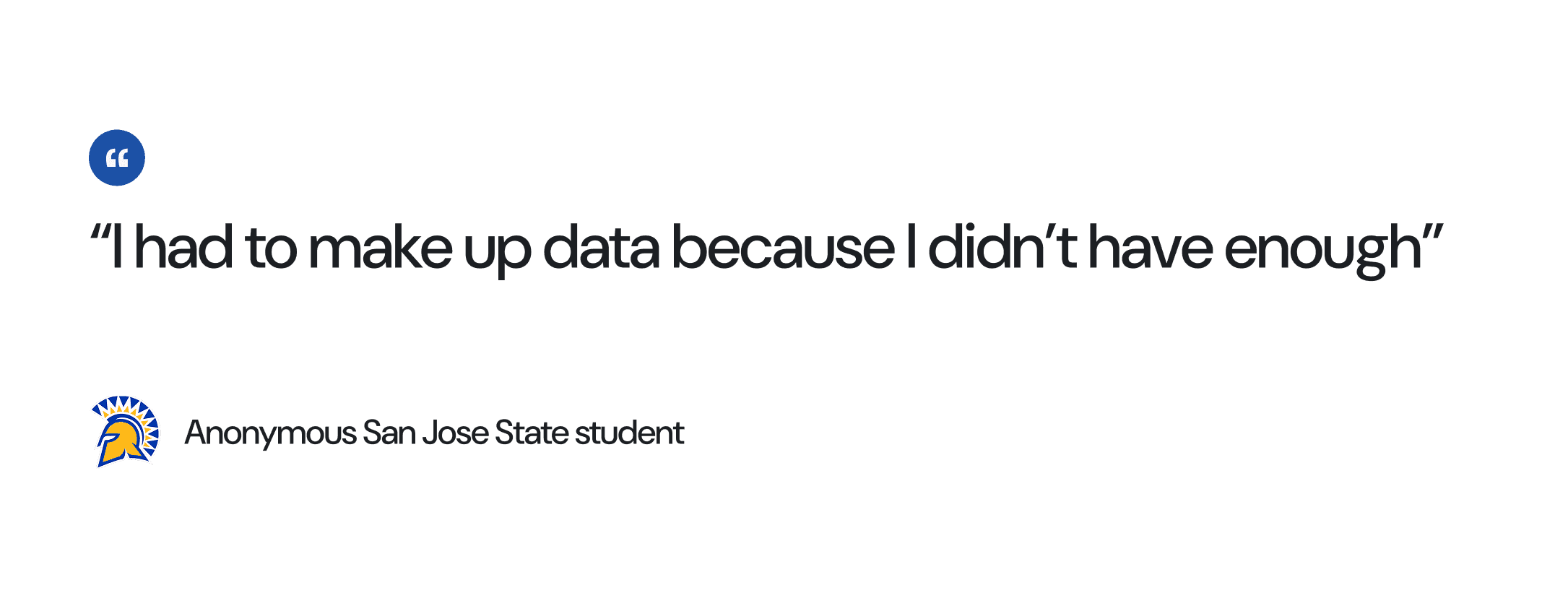
These three quotes capture the core tension at a glance: participants have limited time to find and join studies, while researchers struggle so much with recruitment that they end up compromising their own data integrity out of necessity.
How Researchers Currently Recruit (Observational Study)
I observed and catalogued the methods researchers use to find participants. Every current method has a critical flaw:
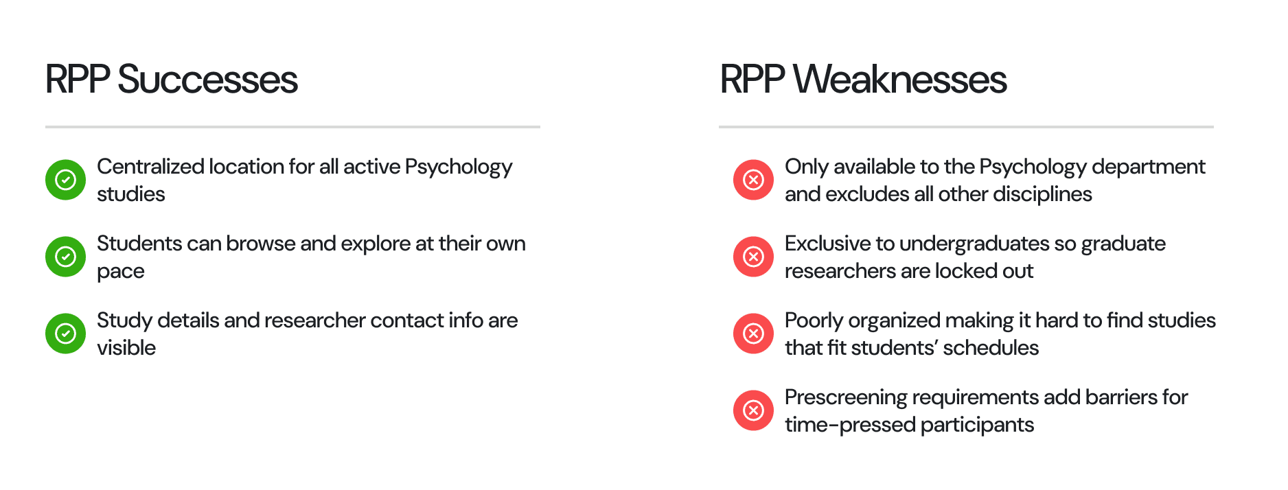
Competitive Analysis: RPP
The Research Participation Program (RPP) is the closest thing to a centralized solution that already exists. It has real strengths: students can browse active studies and contact information is shown. This is a good model of a solution that works to serve a need, however it neglects the larger student population since it is only capable of connecting Psychology students to Psychology research on campus, making it an ineffective solution to the broader problem.
Research Analysis
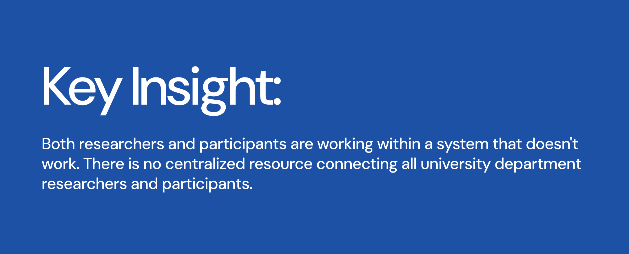
Participants aren't lazy or disengaged, they're overwhelmed by poorly targeted outreach and have no single trusted place to find studies that fit their lives. Researchers aren't failing at communication, they're operating without infrastructure. The opportunity isn't a better flyer or a louder post. It's a platform that makes the match easy.
Users
Two distinct personas emerged from my research, representing the two sides of the participation gap. Both sides are stressed out and overwhelmed but in different ways.
Persona 1: The Researcher
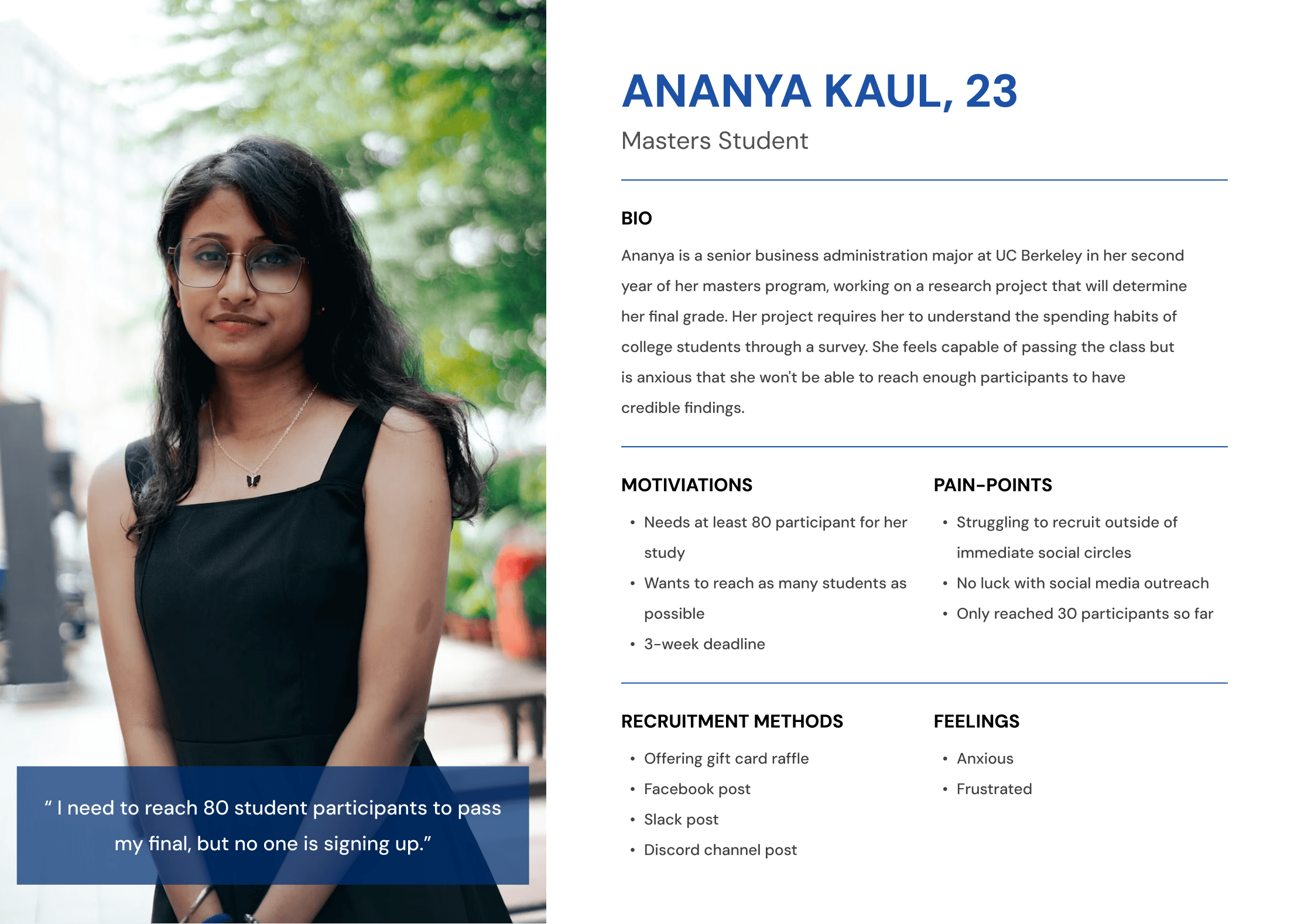
Ananya Kaul, 23. Masters student at UC Berkeley completing a final research project. Needs at least 80 participants to pass her class. She has tried Facebook posts, Slack messages, Discord channel posts, and gift card raffles and still only reached 30 participants.
Persona 2: The Participant
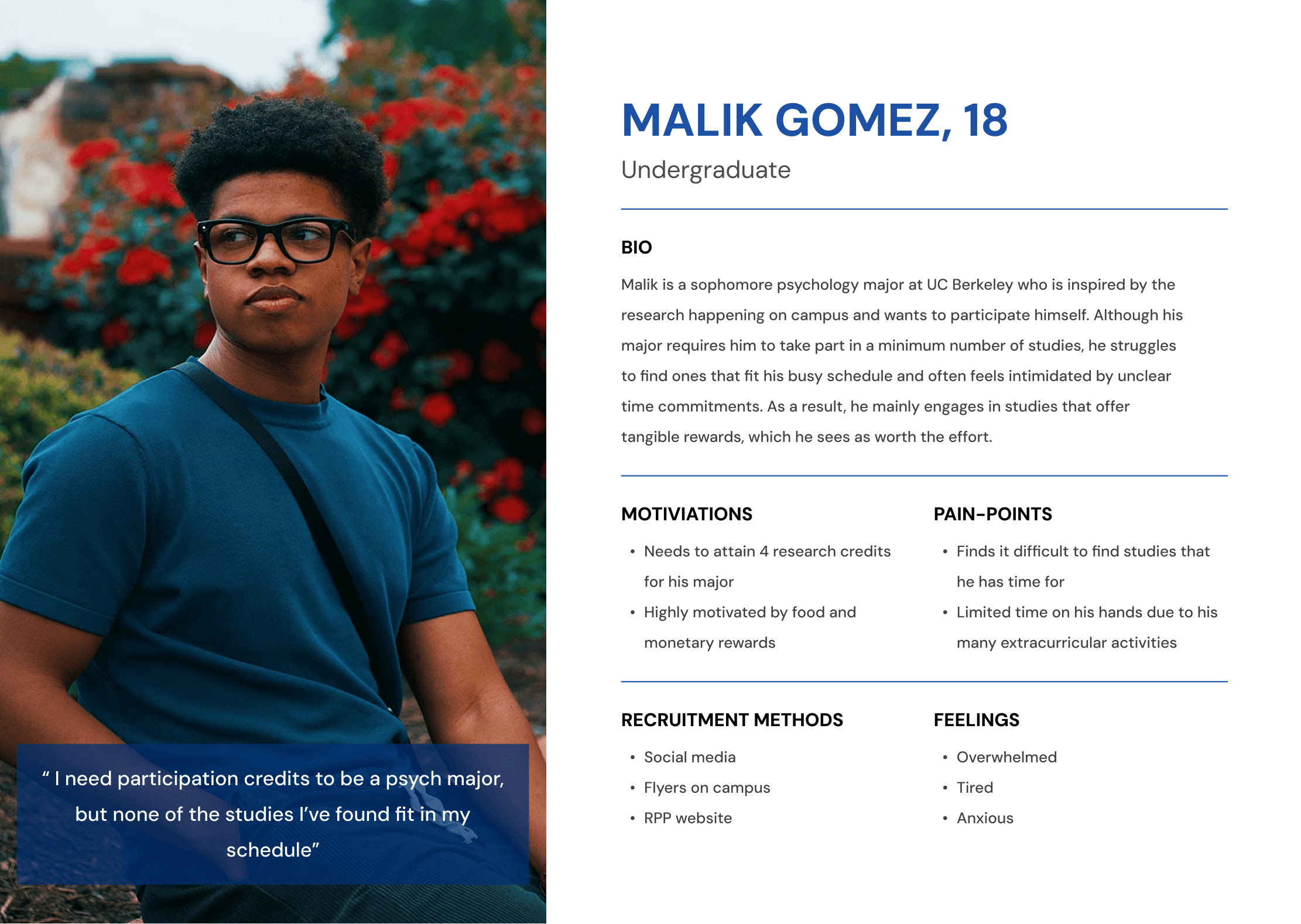
Malik Gomez, 18. Undergraduate psychology major at UC Berkeley. Needs to fulfill research credit requirements for his major but struggles to find studies that fit around his extracurriculars. Feels overwhelmed and anxious about meeting his quota.
The Solution
StudySpotter centralizes campus research by connecting student researchers and participants, simplifying recruitment and enabling cross-department collaboration. It's a web platform where any student, regardless of department or year, can find studies they're eligible for, or post studies to reach a qualified pool of participants.
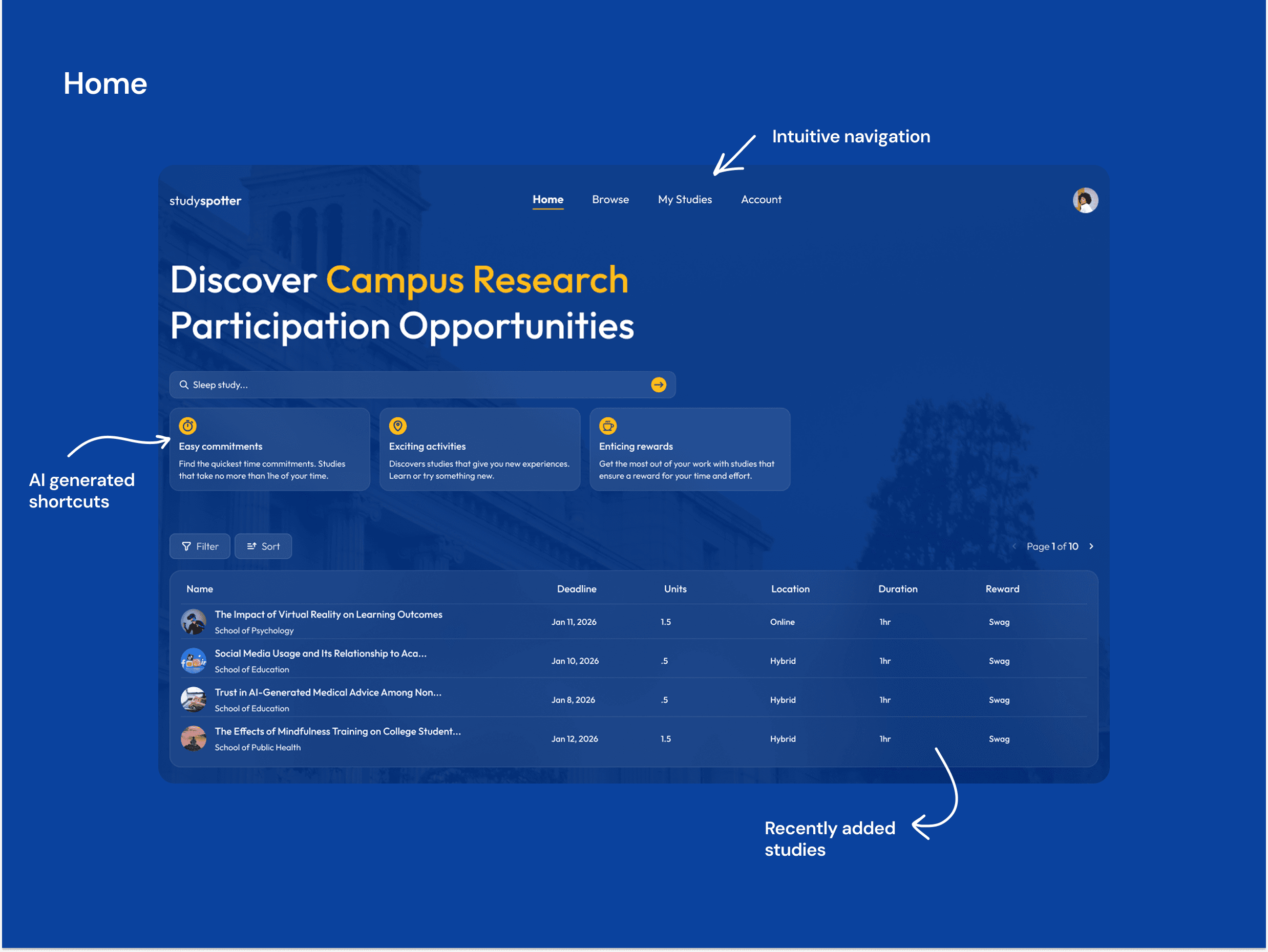
Feature 1: Home
The home page is the first thing both participants and researchers see after logging in. A prominent search bar invites users to jump straight to a specific study, while three AI-generated shortcut cards surface studies based on behavioral categories: Easy Commitments (shortest time requirements), Exciting Activities (novel or experiential studies), and Enticing Rewards (studies with gift cards, food, or swag). Below, a live table of recently added studies gives users an immediate sense of what's available without any filtering required.
Addresses: The discoverability problem. Participants don't know what studies exist or where to start. The AI shortcuts reduce the cognitive load of browsing by surfacing studies matched to what participants actually care about: their time, their interests, and their reward.
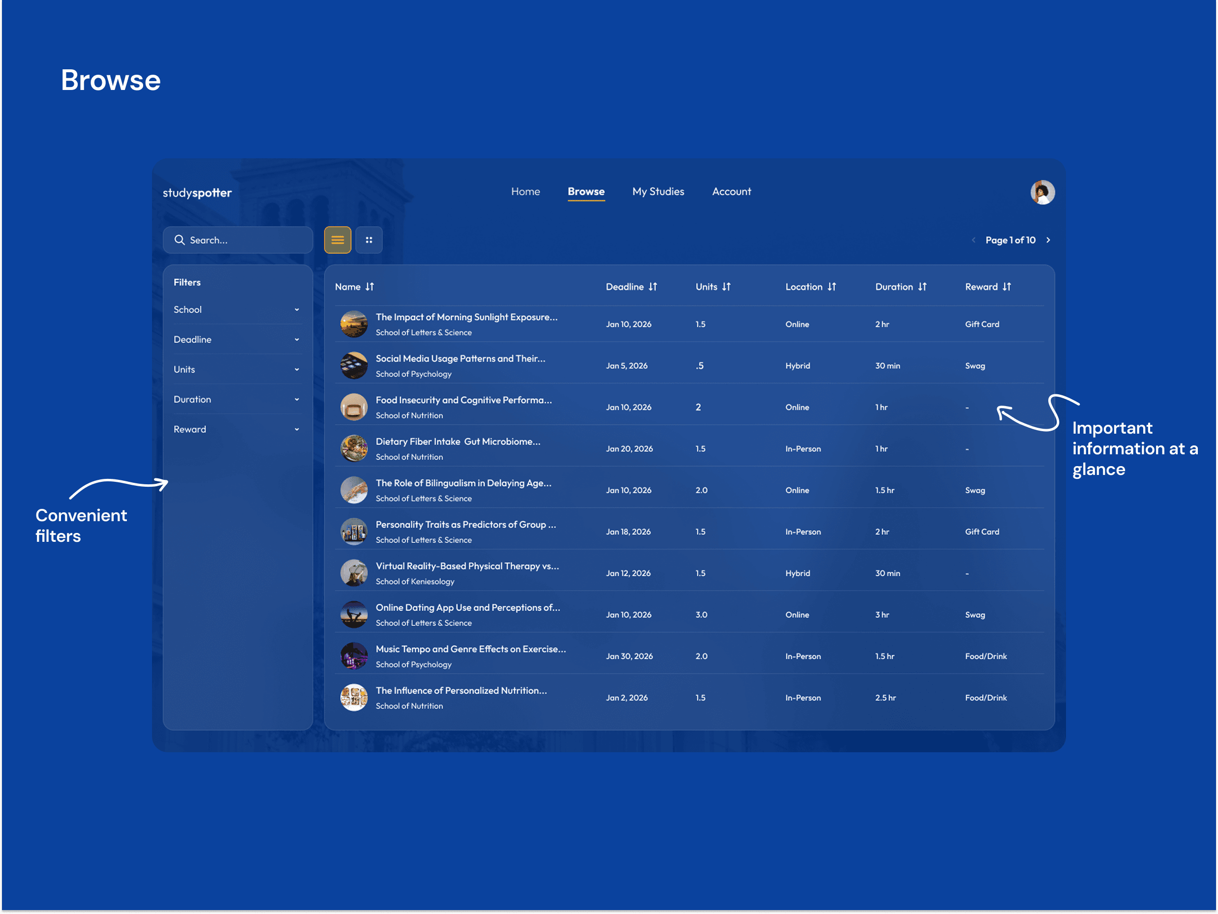
Feature 2: Browse
The browse page gives participants full control over finding studies that fit their lives. A filterable, sortable table displays every available study across all departments, showing name, school, deadline, unit count, location, duration, and reward type at a glance. Filters on the left let users narrow by school, deadline, units, duration, and reward type, while column headers allow sorting in any direction. A list and grid view toggle accommodates different browsing preferences.
Addresses: The time mismatch problem. Participants abandon sign-ups when study requirements aren't clear upfront. Putting deadline, duration, and reward in the same row means participants can qualify or disqualify a study in seconds, without clicking into a separate page.
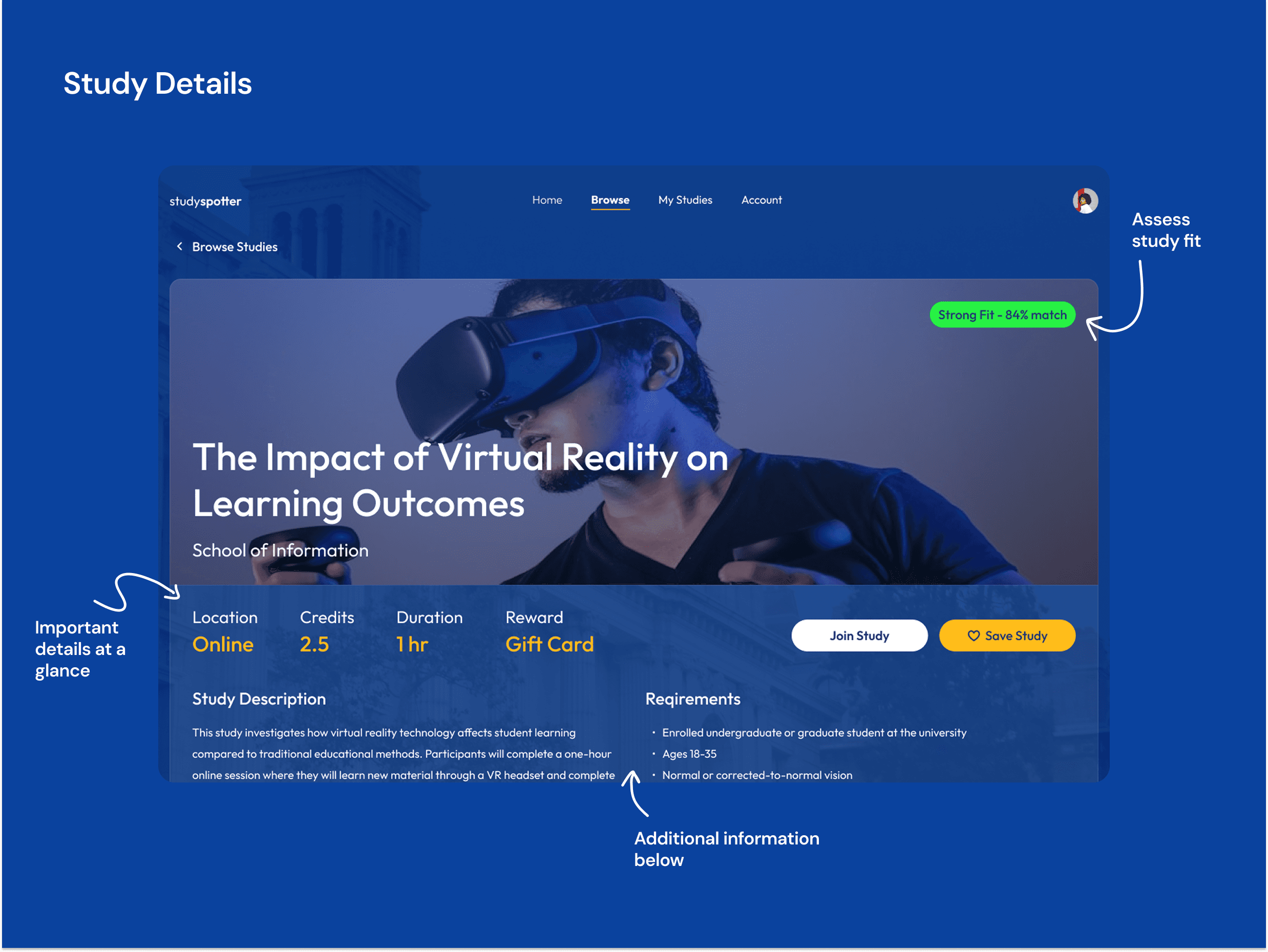
Feature 3: Study Details
Each study listing opens a dedicated details page showing the full picture: study description, school and department, credit value, time commitment, location type, reward, and deadline. A personalized fit analysis compares the study's requirements against the user's profile and availability to surface a clear compatibility signal before they commit, so participants can make an informed decision rather than sign up and drop out.
Addresses: The incomplete information problem. Participants who sign up without fully understanding a study's requirements are more likely to withdraw, which directly undermines researchers' sample sizes. Full upfront transparency reduces dropouts and saves time for both sides.
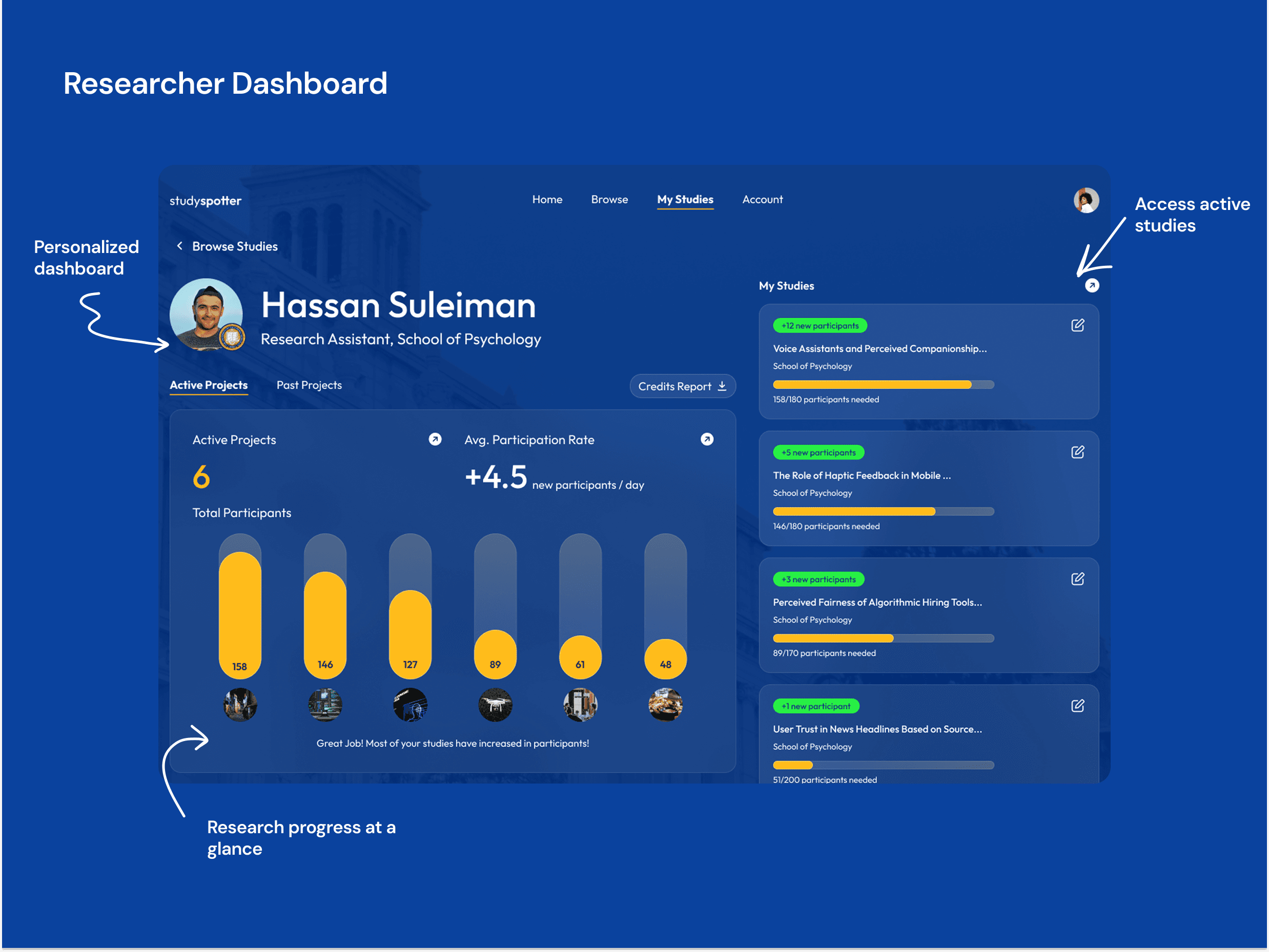
Feature 4: Researcher Dashboard
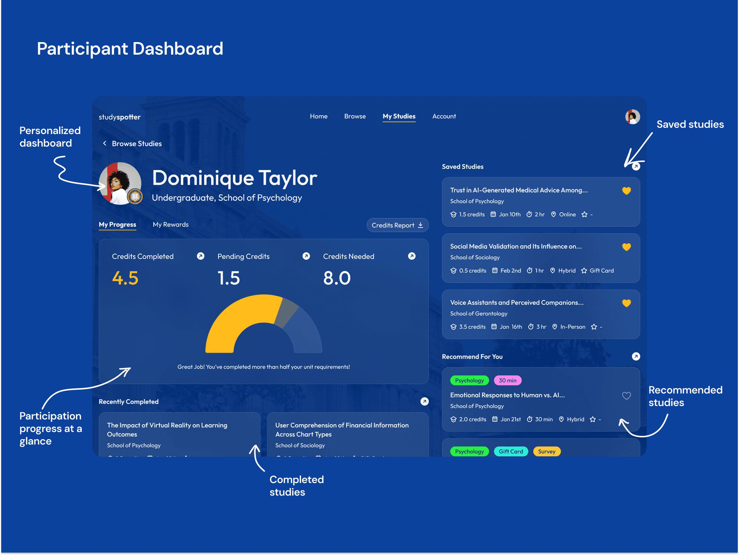
The participant dashboard gives students a centralized view of their entire research credit journey. A progress gauge shows credits completed, credits pending, and credits still needed, with an encouraging prompt when milestones are reached. A recently completed section keeps finished studies accessible, while a saved studies panel on the right lets participants return to studies they bookmarked. A recommended studies section surfaces new opportunities matched to their profile, so the dashboard doubles as a discovery tool even after onboarding.
Addresses: The anxiety and overwhelm participants feel about meeting their credit quota. By making progress visible and actionable in one place, rather than scattered across emails, professor instructions, and the RPP website, the dashboard turns a stressful obligation into a manageable, trackable goal.
Feature 5: Participant Dashboard
The researcher dashboard gives student researchers a real-time view of their recruitment momentum across all active studies. An active projects count and average daily participation rate sit at the top, followed by a bar chart showing total participants per study, making it immediately clear which studies are on track and which need attention. The right panel lists each active study with a live progress bar showing participants recruited against the target, and a green badge flagging new sign-ups since the last visit.
Addresses: The visibility problem researchers face when running multiple studies simultaneously with no centralized tracking. Without this view, researchers have no way to know whether their recruitment is working until it's too late to course-correct. The dashboard turns a blind process into a transparent, manageable one.
SUCCESS METRICS DEFINED
Time saved finding or recruiting for studies (measured in hours)
Self-reported stress reduction vs. previous methods
Preference over previous recruitment methods
Number of studies uploaded to the platform
Conversion rate: studies added → studies completed with full participant quota
Reflection & Next Steps
One thing I'd do differently: I'd involve researchers earlier in the feature prioritization process. The researcher profile was designed primarily from the participant perspective, and with more researcher input, I suspect the dashboard metrics and filtering tools would look quite different.
With more time, I'd build and test four additional features:
Scan poster → Post study: Let researchers create a listing by photographing their existing recruitment flyer
Non-academic studies: Expand the platform beyond course-credit studies to paid and community research
Study credit completion plan: Help participants plan their credit schedule across the semester
Connect students with research opportunities: Allow undergraduates to express interest in working on faculty-led research projects
Design System
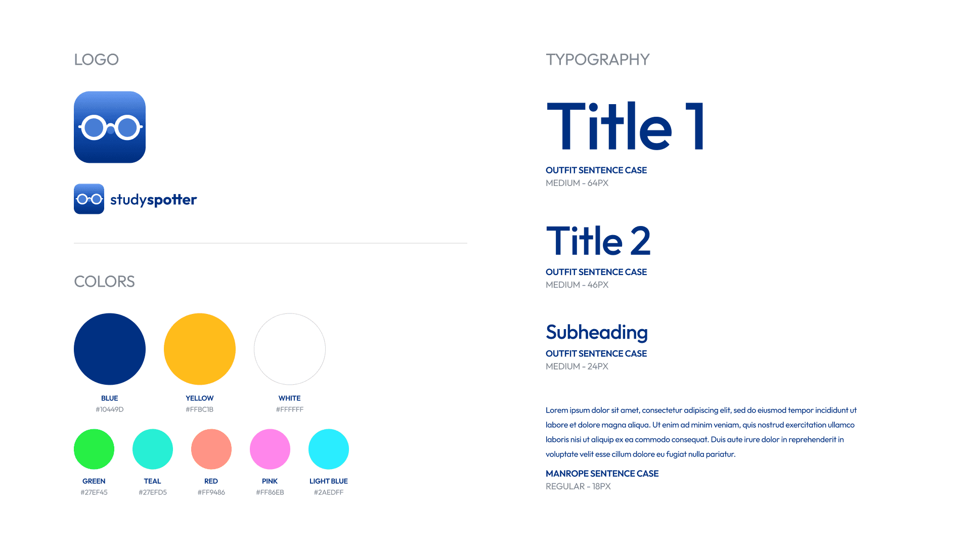
StudySpotter's visual identity needed to feel both academic and approachable. Students should find it credible enough for a research context but user friendly enough for stressed undergraduates to navigate with ease.

